App Icon and Splash Screen
App Icon
The App Icon is the small image users tap on their phone's home screen and see in the App Store / Play Store listing. It is the single most important visual asset for your app: thousands of people will see the icon long before they ever see the rest of the design.
Swiftspeed lets you upload one square source image; the editor crops it, resizes it for every iOS and Android density, and bakes the result into the next build. No need to generate the dozen icon sizes the platforms require.
Opening the Customize Page
From the dashboard, click the edit pencil on the app you want to set the icon and splash screen for.
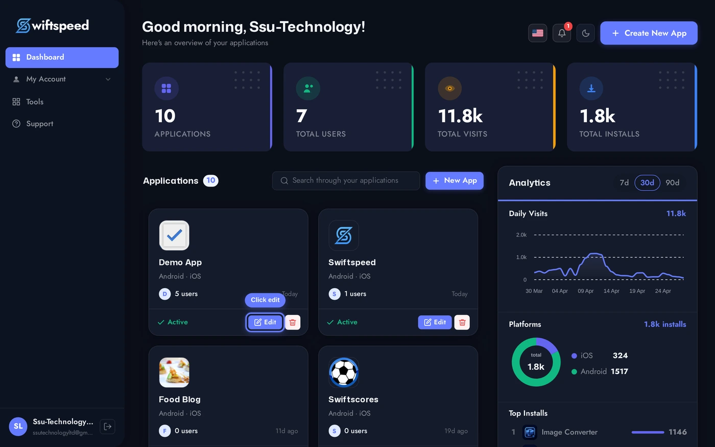
In the editor top bar, click Customize. The page stacks four cards: General Info (Pro plan), App Icon, Splash Screen, and Back Button Style (Pro plan). The first three are what most apps need.
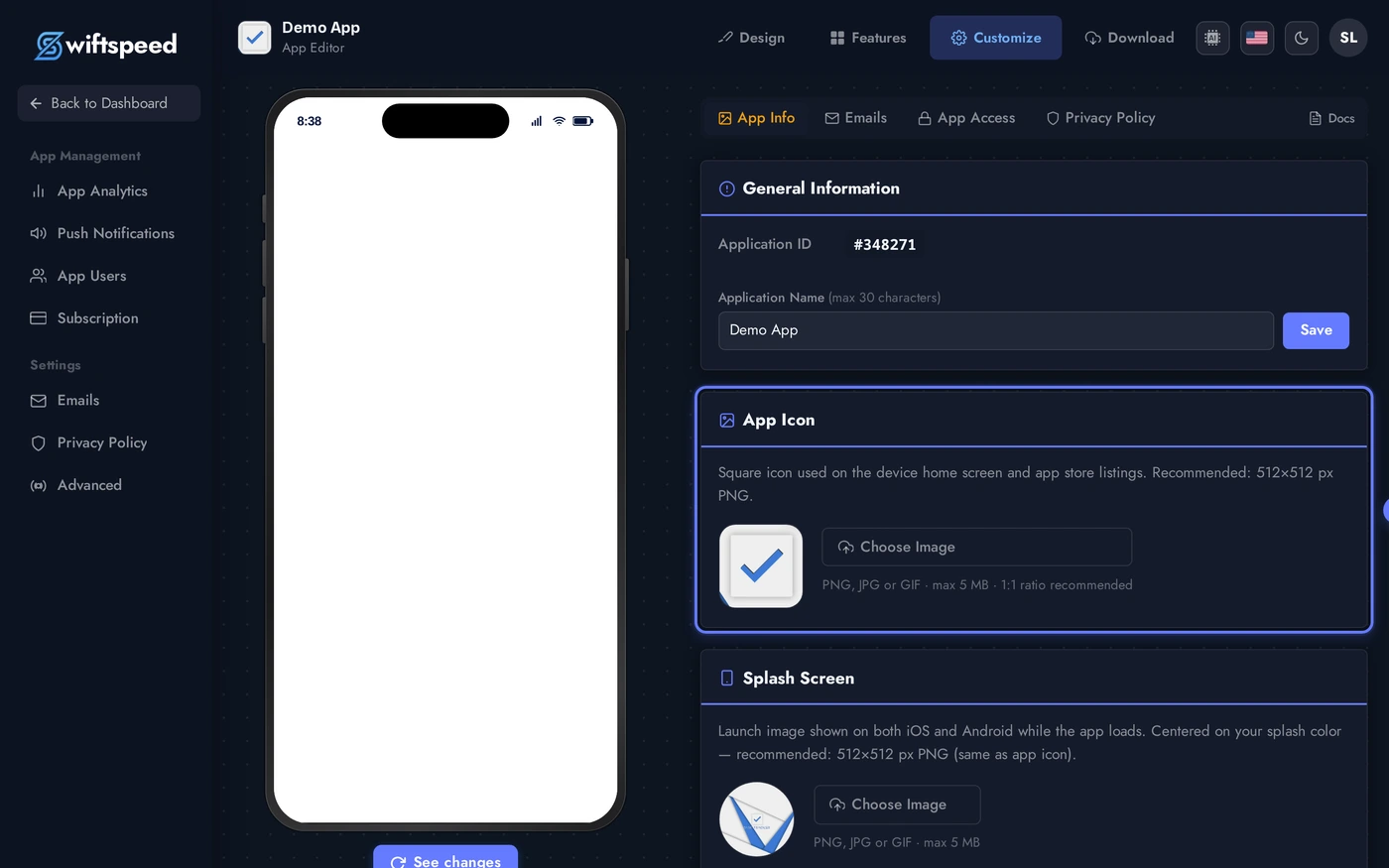
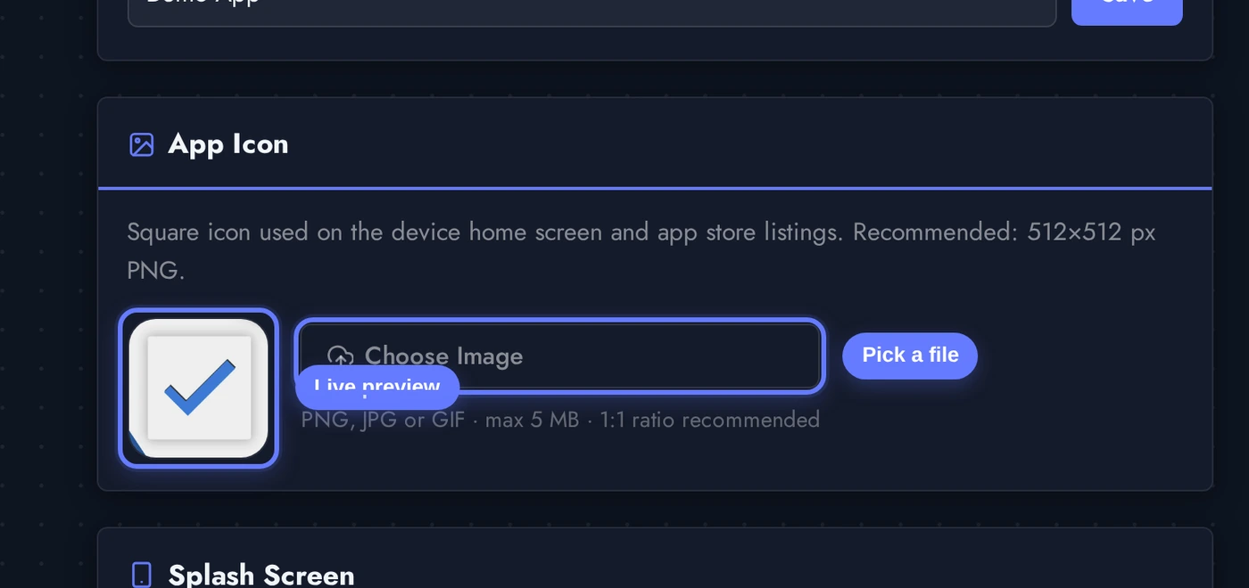
Setting Your App Icon
The App Icon card has a square preview on the left and an upload button on the right. Click Choose Image and pick any PNG, JPEG, GIF, or WebP. After upload, a built-in cropper opens and lets you frame the icon to a 1:1 square.
Recommended source size is 1024x1024 so the editor has enough resolution to generate every density required by iOS (20pt to 1024pt) and Android (mdpi to xxxhdpi) without upscaling.
After cropping, the icon saves automatically. The square preview updates immediately. The change is baked into your next APK / IPA, customers with the app already installed see the new icon when they update.
Icon Design Guidelines
A few rules that make icons read well at every size:
- Square, full-bleed, no padding. Both iOS and Android crop and round the icon themselves. Add your own rounded corners or transparent background and you end up with a tiny icon floating inside extra space.
- No text. Even a single word becomes unreadable at the 60x60 size used in many app trays. Use a logomark or symbol instead. The app name appears below the icon automatically.
- Bold, single-color shapes. Detailed gradients and photography blur into mush at small sizes. The icon should be recognisable at 20x20 pixels.
- Match your brand at every density. Test the icon on a phone home screen against your brand's typical wallpaper before locking it in.
- iOS rounds the corners at the system level. Don't pre-round the icon, you will end up with rounded-corner-inside-rounded-corner artifacts on iOS 18+.
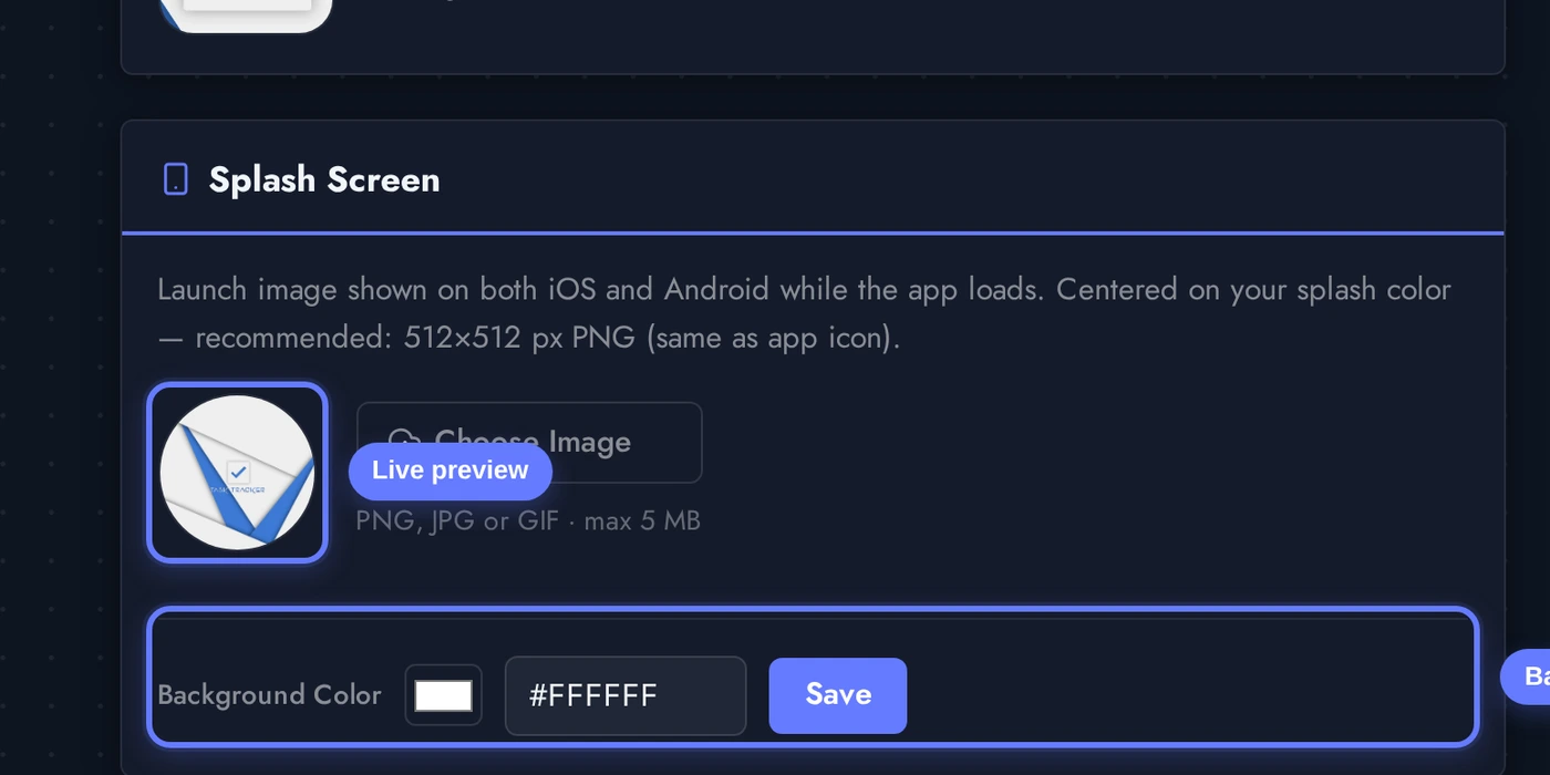
Splash Screen
The Splash Screen is the full-screen image briefly shown while the app boots. It buys you 1 to 3 seconds to load resources without showing a blank screen, and reinforces brand recognition every time someone opens the app.
Two pieces: a centred image (typically your logomark) and a background color filling the rest of the screen.
Upload the splash image (square logomark works best), then pick the background color via the color picker or paste a hex code into the field. Click Save next to the color to apply.
Splash Screen Tips
- Image at 2048x2048. The splash is shown on tablets too, so it must scale up cleanly. PNG with transparency over a coloured background gives the most flexibility.
- Centre the logo, leave breathing room. Phones come in many aspect ratios. The system centres your image on every device; if the design touches the edges, it will be cropped on the wider devices.
- Background color matters. A coloured background reads as branded; pure white reads as "still loading". Pick a color from your brand palette so the launch feels intentional.
- Match the splash background to the first screen the app lands on. A user opens your app and the splash fades into the home screen, if the colors don't match, you get a visible flash.
- Avoid tagline text. Same reason as the icon: it becomes unreadable on small phones, and "we are loading" energy is not what you want from your launch screen.
Where Else You Set Visuals
- App Name (header in the General Info card), the name shown under the icon on home screens and in the app store. Edit here, save, redeploy.
- App Store listing assets, separate from the icon. Marketing screenshots, store description, keywords live on the Customize > App Info sub-pages and the Download / Publish flow.
- Tab bar icons / feature icons inside the app, set per-feature in the Features tab. The app icon does not affect those.
- Push notification badge / silent icon, auto-derived from your app icon by both iOS and Android. You don't set this separately.
Tips and Gotchas
- Changes only ship in a new build. Setting the icon in the editor doesn't push to existing installs automatically. Generate a new APK / IPA and submit the update for customers to receive the new icon.
- Use the cropper, do not pre-crop. The built-in cropper produces every required size from one source. Pre-cropping into a square locks you out of future re-crops.
- The same icon ships to iOS and Android. No need to upload separate assets per platform. The editor generates the platform-specific deliverables from the single source you upload.
- Splash background = first paint color. If you're unsure what to pick, set it to the same color as the home screen background of your chosen template.
- App store policies still apply. Apple and Google reject icons that look too similar to system icons or other popular apps. Stick to your own brand identity.