Branding Configuration
What Counts as Branding
Branding in a mobile app is the consistent visual identity customers see at every touchpoint: the icon on their home screen, the splash screen on launch, the colors and typography of every screen, the small chrome details (back-button shape, header style, tab-bar look). Swiftspeed splits these settings across two pages of the editor: Customize (assets like icon and splash) and Design (templates, layouts, colors). This article ties them together.
The Branding Checklist
Open the app in the editor.
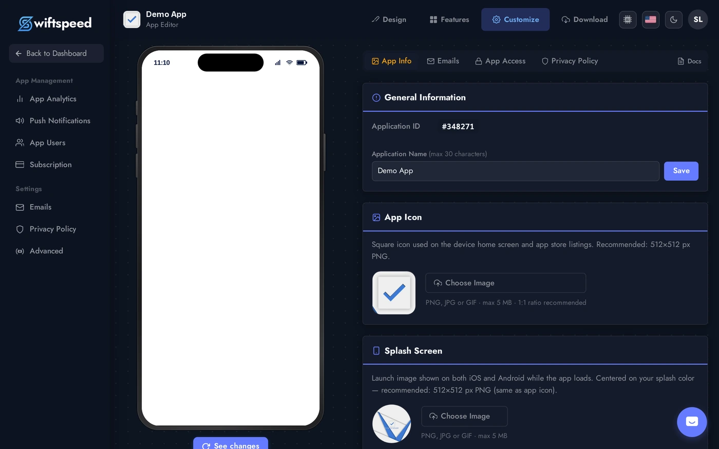
Step 1: Customize. Set the app name, upload the app icon (1024x1024 PNG), upload the splash screen image, set the splash background color. The Back Button Style card (Pro plan) controls the chevron style across the app.
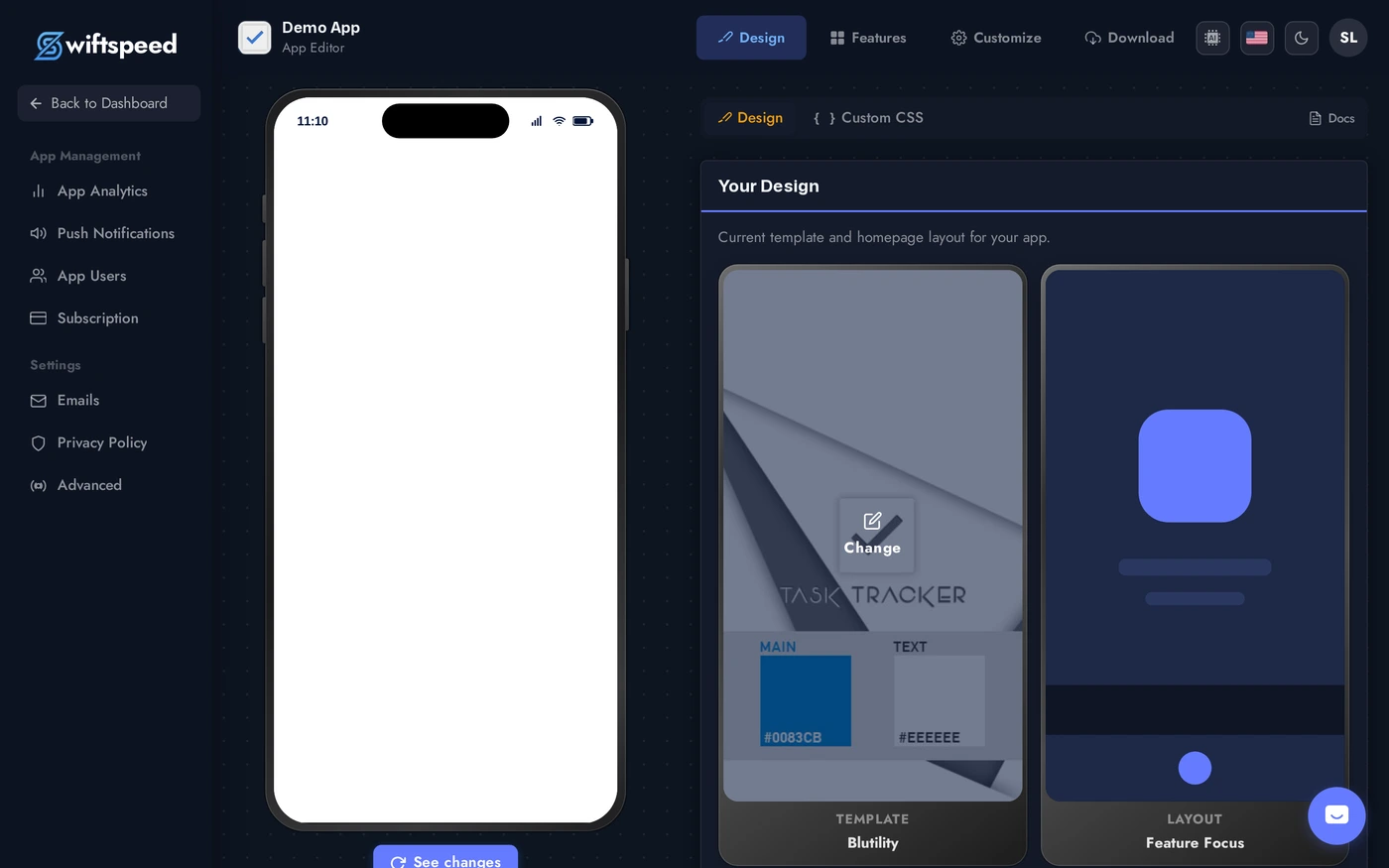
Step 2: Design. Pick a template that fits your industry (the editor preselects one based on the kind of app you are building), then a homepage layout (grid, list, hero, magazine, Feature Focus, Feature Focus Pro). Both swap without losing content.
Step 3: Design > Colors sub-tab. Override the template's default palette with your brand colors (primary, accent, background, text). The phone preview reflects every change instantly.

The Order to Apply Changes
- Pick the template first. Templates carry default colors and chrome that work as a unit, picking colors first then a clashing template wastes the work.
- Set the app icon early. It is the single most-seen asset. Get it right before tweaking screens nobody will see if the icon makes them skip the install.
- Splash screen + background color must match the home screen. The splash fades into the first screen on launch; mismatched colors cause a visible flash.
- Lock the layout last. It changes home-screen behavior more than any other setting. Confirm with real customers (or yourself, on a real phone) before final approval.
Tips
- Test on a real device. The phone preview is accurate but a real iPhone / Android shows actual size, system fonts, and surrounding UI you cannot replicate in a browser.
- Custom colors override template colors. You can leave most of the template alone and only set 1-2 colors (e.g. accent + header). The rest stays harmonious with the template.
- Match your marketing site. App users move between your website and your app. Same logo, same colors, same voice. Inconsistent branding feels broken.
- Save app store screenshots for last. Every time you change branding, you redo the screenshots in the App Store / Play Store listing. Lock the look first.