Form Builder Feature
What is the Form Builder Feature?
The Form Builder feature is a drag-and-drop form builder that lives inside your mobile app. Users open the form page, fill in the fields, hit Submit, and the response lands in the editor for you to read and export. No third-party form service required.
Field types cover everything a typical mobile form needs: short text, long text, email, phone, number, date, time, multi-select, single-select, file upload, image upload, signature pad, terms-of-service agreement, section break, illustrative images, and rich-text instructions. Submissions can fire two notification emails: one to an admin address with the response, one to the user with a confirmation.
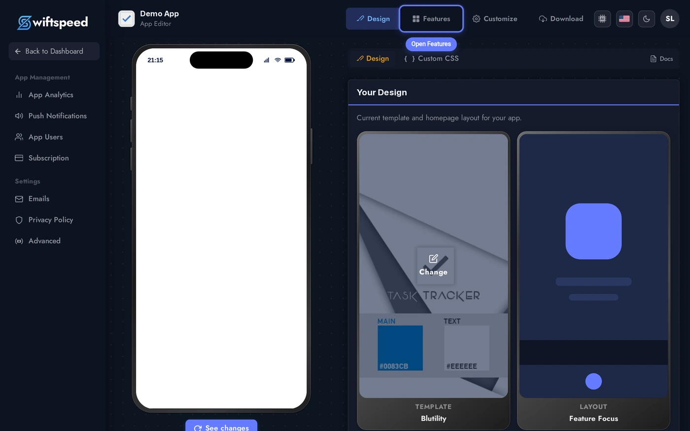
Adding the Form Feature to Your Mobile App
Click the edit pencil on the mobile app you want to add a form to.

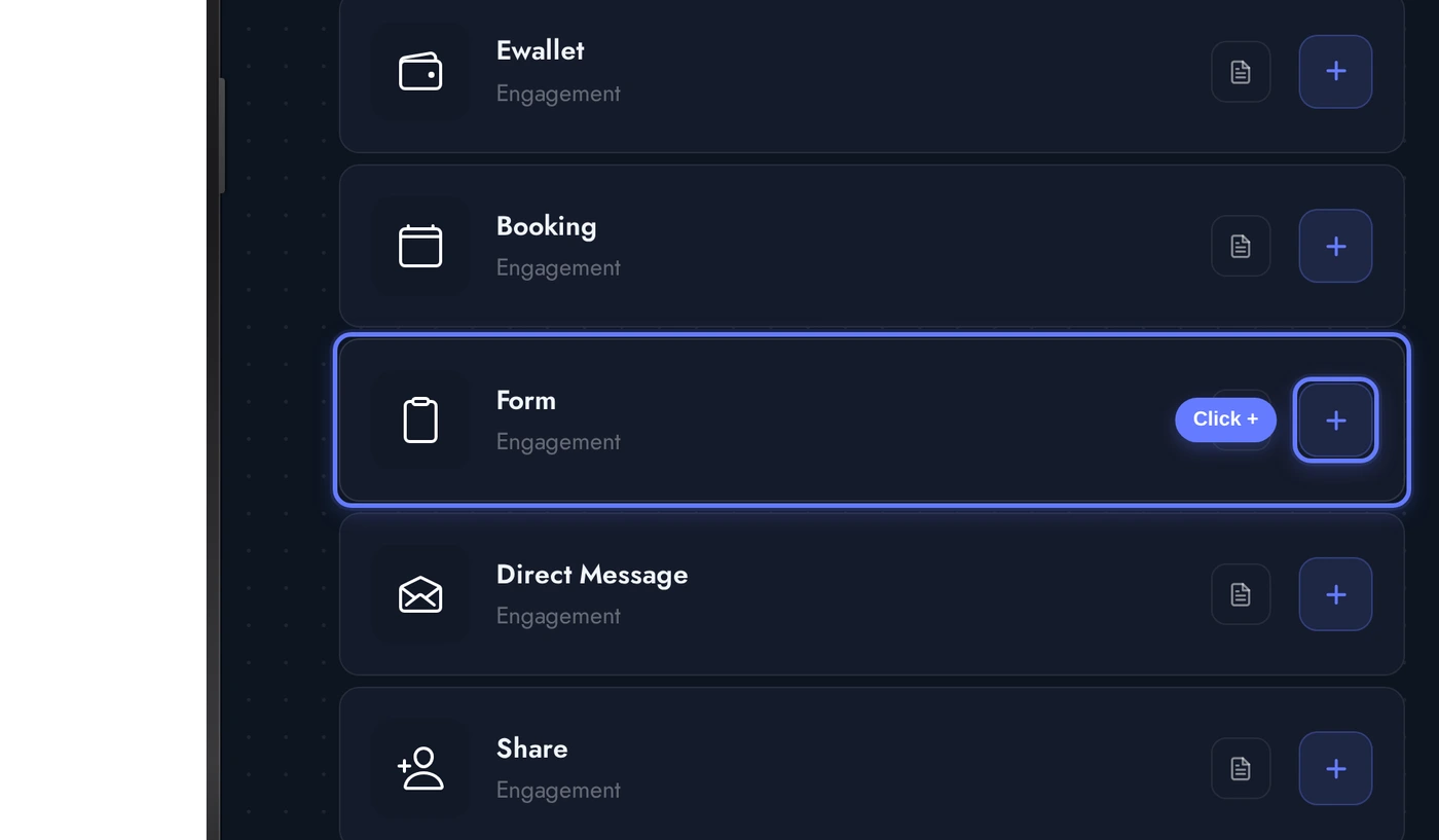
Click Features in the top bar of the App Editor.
Find the Form card and click the + button. The native form is added to the app, ready for you to start adding fields.
The Editor: Cards From Top to Bottom
When the Form editor opens, several cards stack vertically:
Three demo fields seeded for the screenshot: a required text field for Name, a required email field, and a required long-text field for Message. Drag the handle on the left of each field to reorder. Click any field to expand its options.
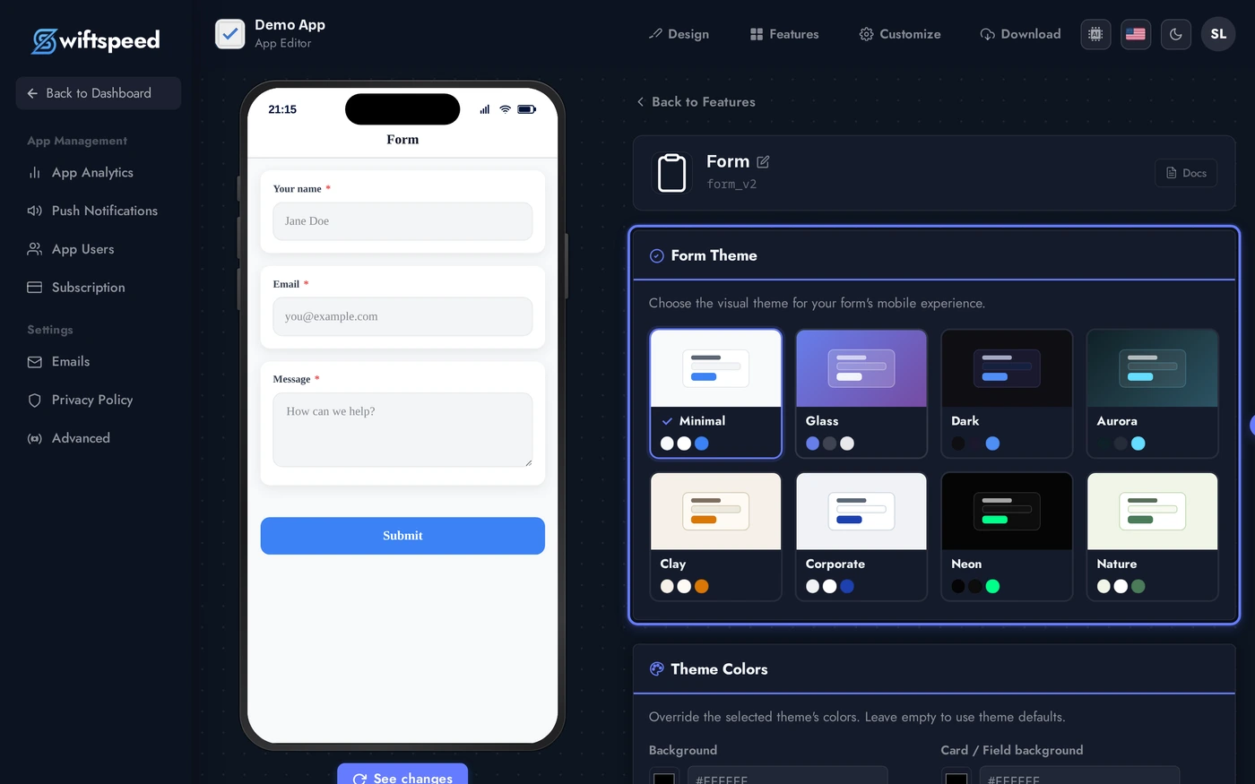
- Header: form title and subtitle shown at the top of the customer-facing form.
- Appearance: theme + custom colors that style the form fields, labels, buttons, and background.
- Email Notifications: optional admin recipient address and the email subject + body templates for both admin and user.
- Form Fields: the actual builder. Add field dropdown lists every field type. Each field has its own inline editor for label, placeholder, helper text, required toggle, and field-type-specific options (number range, date format, dropdown options, etc.).
- Submission: success message, optional redirect URL after submit, customizable submit button label.
Field Types
The Add field dropdown in the Form Fields card lists every type:
- Short text / Long text: single-line input or multi-line textarea.
- Email / Phone: typed inputs with native keyboard hints (email keyboard on iOS, phone pad).
- Number: numeric input with optional min, max, and step.
- Date / Date and time: native date pickers; format and allowed days configurable.
- Dropdown / Multi-select: list of options. Each option editable inline.
- Checkbox / Radio: yes/no or pick-one fields.
- File upload: any file type with configurable max size (1MB to 50MB).
- Image upload: photo capture from camera or gallery; multi-image variant supported.
- Signature: canvas signature pad. Saved as PNG with the submission.
- Terms agreement: required checkbox with a modal showing rich-text terms (clickwrap pattern).
- Section break: heading + optional description to group fields.
- Illustration: read-only image inserted into the form (e.g. logo, hero, instructional diagram).
- Rich text: read-only formatted instructions inside the form flow.
Email Notifications
Two notification flows fire on each submission:
- To the admin: every submission emails the address you configure here. Subject and body templates are editable. The full submission contents are appended automatically below your custom message.
- To the user: optional confirmation sent to whatever email field is in the form (auto-detected). Subject and body templates are editable so you can match brand voice.
- Latency: under 30 seconds in normal conditions. Very large forms (with file uploads) may take longer because the upload completes before the email fires.
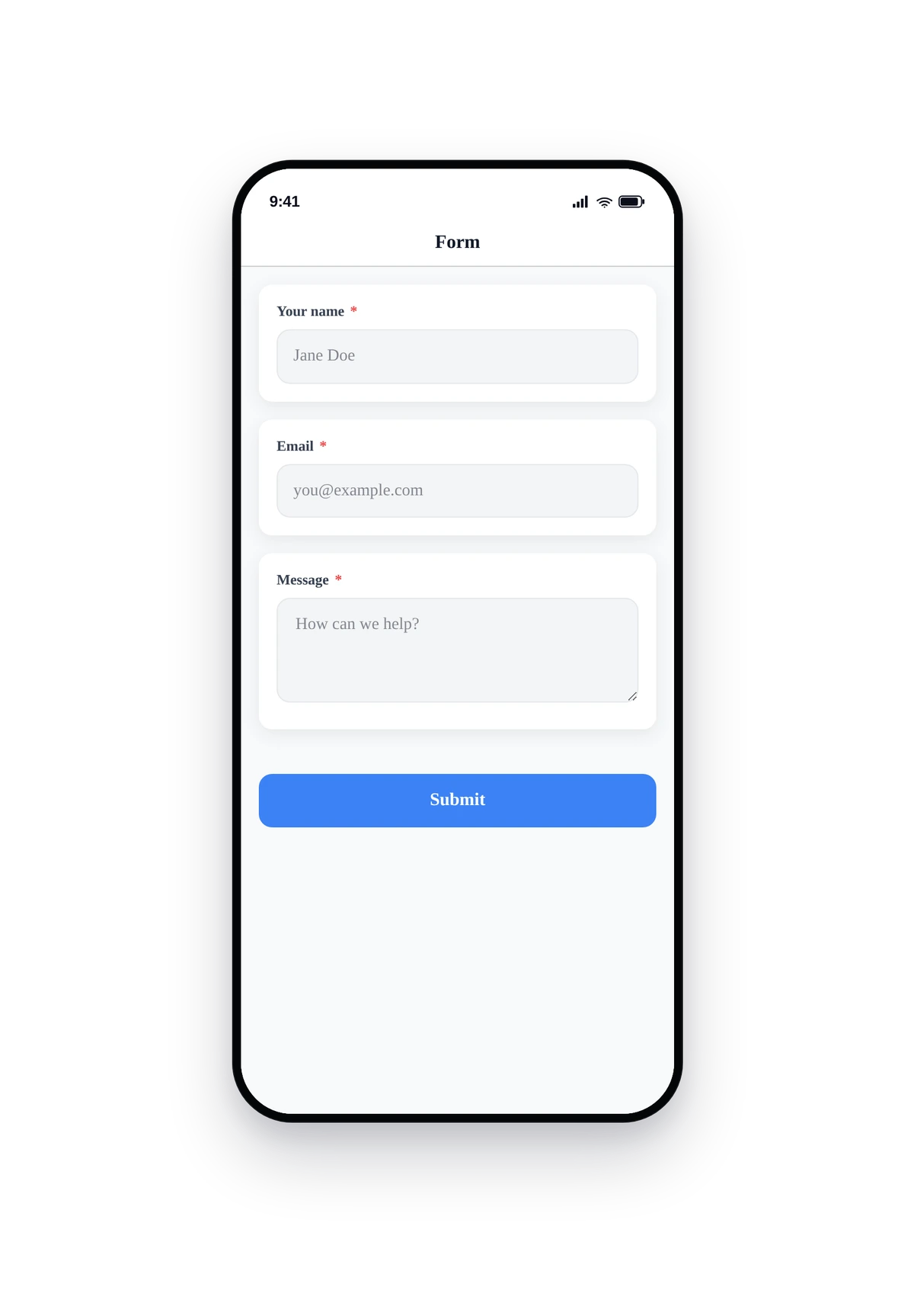
Live Preview of the Form
Here is how the seeded contact form renders inside a real phone:
This is the actual native UI. The fields use native keyboards (email keyboard for the email field, etc.), validation runs on Submit, and the success state renders inline (or redirects to your URL if set).
Tips and Best Practices
- Fewer fields convert better. A 3-field form (name, email, message) submits 5x more often than a 12-field form. Keep it minimal.
- Mark only what you actually need as required. Required fields kill submissions when the user does not have the answer to hand. Phone numbers and addresses are usually optional unless legally required.
- Use Section breaks for long forms. When a form really does need 10+ fields (e.g. event registration, detailed application), section breaks make it scannable.
- Set a realistic max file size. Default is 1MB. Bump to 10-25MB only when the form needs to accept photos or PDFs. Above 25MB starts to fail on slow mobile networks.
- Test on a real device. The native field types (date, multi-select, signature) feel different on iPhone vs Android. Submit one of your own forms from your phone before publishing.
- The success URL is opt-in. Most apps leave it blank and rely on the inline success message. Use the URL only when the form is the entry point to a downstream workflow (e.g. payment page).
- File uploads are stored per-app. Submissions show direct download links inside the editor. Files persist until the submission row is deleted.