How to Switch Templates
Switching Your App Template
Every Swiftspeed app ships with a template (the overall visual identity, including tab bar, navigation patterns, and chrome) and a homepage layout (the arrangement of feature tiles on the home screen). Both can be swapped any time without losing your features, customer data, or content.
Switching is non-destructive. Your features, customers, custom colors, and uploaded media are preserved across template and layout changes, so you can experiment freely until the app looks right.
Opening the Design Page
From your dashboard, click the edit pencil on the app you want to restyle.
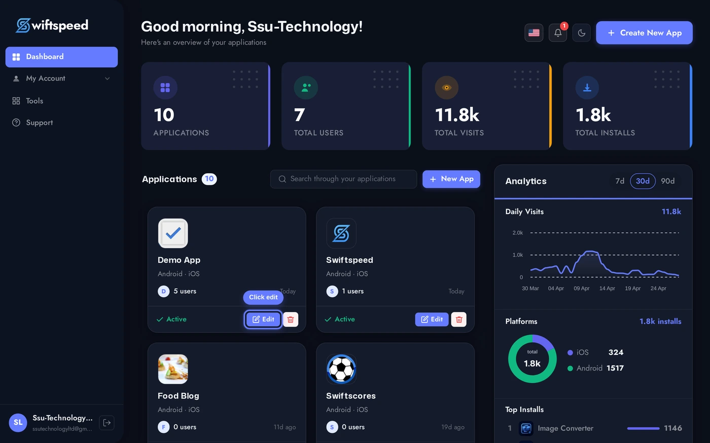
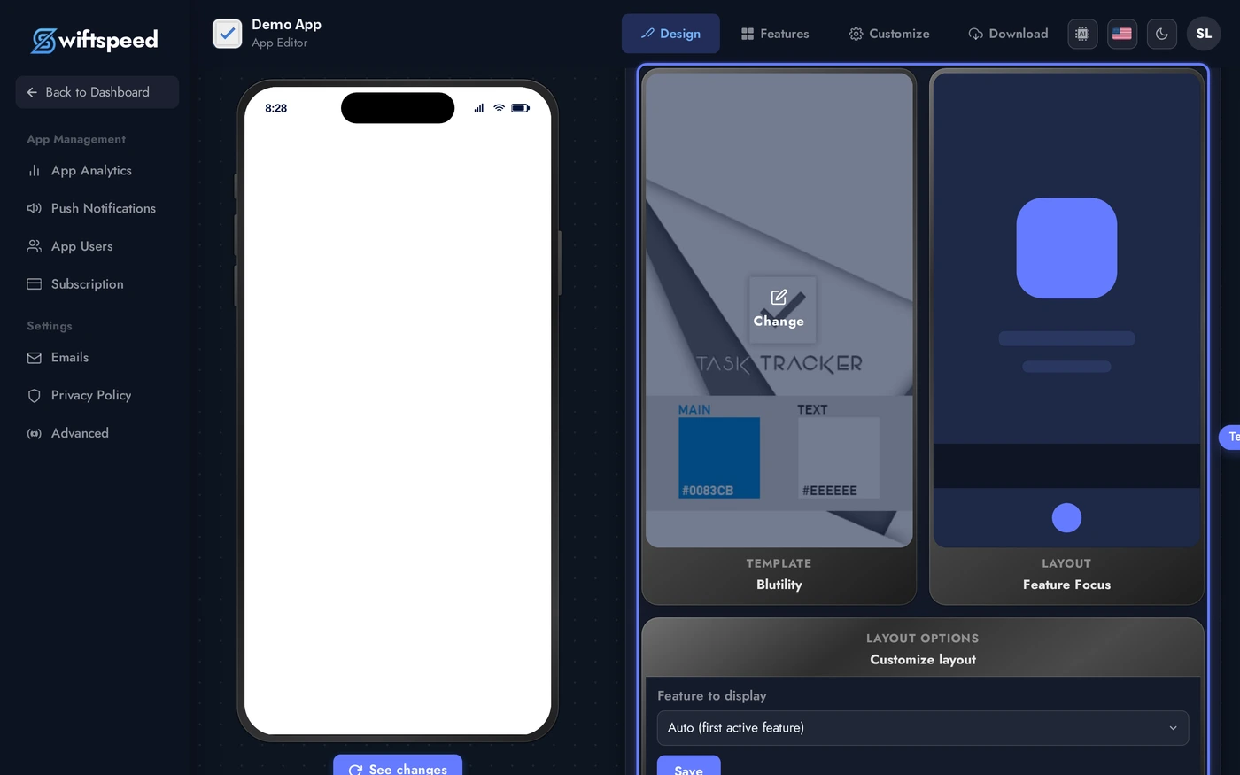
You'll land on the Design page (sidebar, top item). Three cards in a row: Template, Layout, and Layout Options. Each thumbnail shows the current selection.
Changing the Template
The Template is the broad visual identity of your app: colour palette, typography, tab bar style, and navigation chrome. Templates are organised by industry and use case (Business, E-commerce, Media, Music, Food, Education, etc.).
Click the Template card thumbnail (or the Change overlay that appears on hover) to open the template picker. Each tile is a live thumbnail. Click any one to apply, the editor confirms the swap and the live phone preview updates without a re-build.
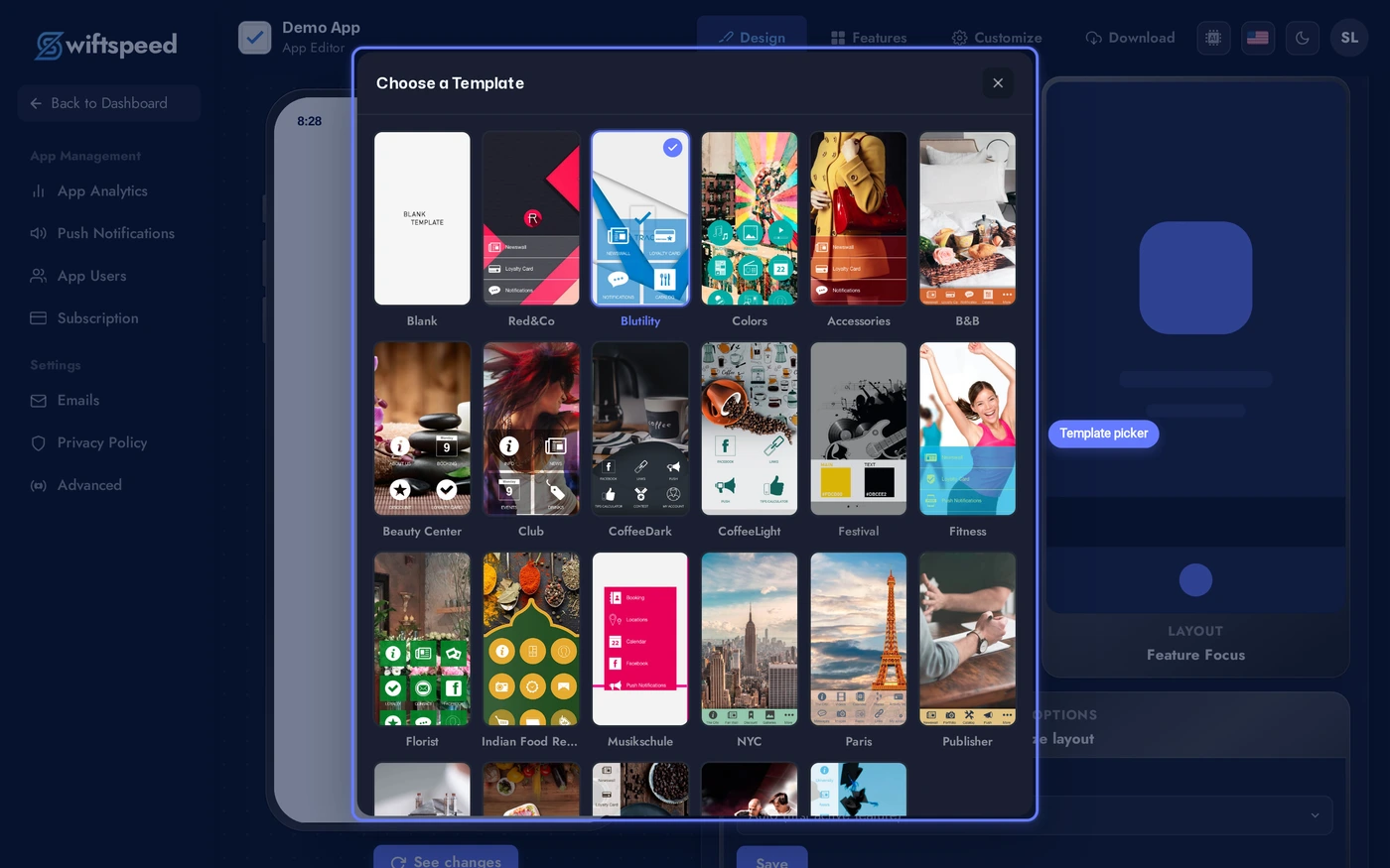
A confirmation appears before any swap takes effect. Templates can be tried back-to-back, your features and content stay where they are between attempts.
Changing the Homepage Layout
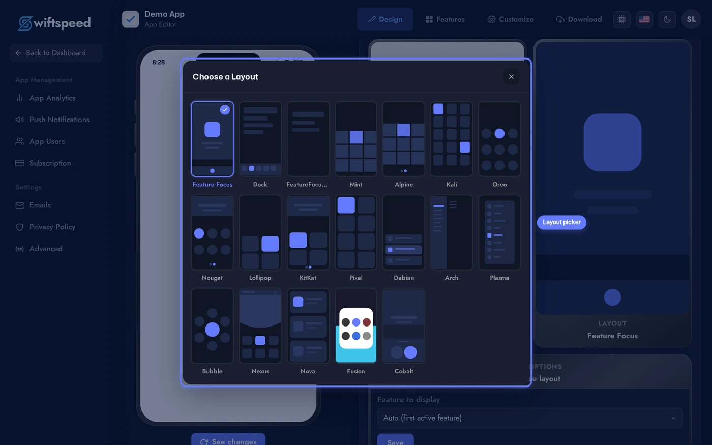
The Layout controls how feature tiles arrange themselves on the home screen: grid, list, hero block, magazine, etc. Layouts are independent of templates, you can mix any layout with any template.
Close the template picker (Esc or the X button), then click the Layout card to open the layout picker. Each tile is a wireframe preview of how home tiles arrange. Click any layout to apply.
Two Special Layouts: Feature Focus and Feature Focus Pro
Two layouts in the picker behave very differently from the rest. They skip or replace the home screen entirely, which makes them ideal for single-purpose apps and tab-bar-driven apps. Both are listed alongside the regular layouts and apply with one click, but they are worth understanding before picking.
- Feature Focus (
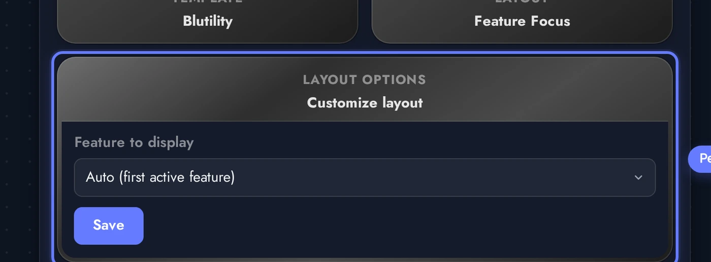
Feature Focusin the picker): the app launches directly into one feature you select, bypassing the home screen completely. All other features are hidden from navigation. Use this when the app exists for one purpose: a single-store WooCommerce app, a one-page contact card, one custom landing page, a single radio station, a one-page weather widget. The Layout Options panel lets you pick which feature opens. If the chosen feature links to the Customer Account, users can still reach the account from inside that feature's flow. - Feature Focus Pro (
Feature Focus Proin the picker): persistent bottom navigation across every feature, no traditional home screen. The app lands on the first feature in your drag order on the Features tab. Looks and feels like Instagram, Twitter, or a banking app. Layout Options expose how many tabs show before the "More" button (1 to 5, default 4), plus the nav background, icon, text, active-icon, and active-text colors. Use this for multi-feature apps where a bottom tab bar feels more native than a home screen full of tiles.
Quick rule of thumb: if the app does one thing, pick Feature Focus. If the app does a few things and the user moves between them constantly, pick Feature Focus Pro. Anything else, pick a regular grid or list layout.
Layout Options
After picking a layout, the third card on the Design page (Layout Options) exposes per-layout knobs: which feature opens first by default, slider behaviour, navigation density, hero auto-rotation interval, and similar tweaks. The exact options change with the layout you picked.
Tweak each option in place. Changes autosave and the live phone preview reflects them instantly, no need to leave the page or republish.
What Changes vs What Stays
Switching templates or layouts is non-destructive. Here's the contract:
- Changes: tab bar style, home screen arrangement, navigation chrome, default theme colour palette (only if you have not overridden it on the Colors tab), shape of feature tiles.
- Stays the same: every feature you have added (Audio, WooCommerce, Custom Pages, etc.), all customer data, all uploaded media, your app icon and splash screen, push notification subscribers, custom colors you have explicitly set, your app store identifiers and signed builds.
- Build implications: existing installed apps keep the old template until customers update from the App Store / Play Store. Generate a new APK / IPA from the Publish page after a template switch if you want to ship the change to existing users.
Tips
- Try templates with real content. A template that looks great with the demo can fall flat once your features are populated. Add at least your first 3-4 features before locking a template in.
- Layout matters more than template for daily use. Customers see the home screen layout dozens of times per session and the template chrome only when navigating. Spend more time picking the right layout.
- Templates do not override Custom Colors. If you have set explicit accent / text / surface colors on the Colors tab, they survive template switches. To start fresh, reset Custom Colors before switching.
- Preview on a real device. The in-builder phone preview is accurate but a real iOS / Android device sometimes surfaces small spacing differences. Generate a development build before final approval.
- Save the App Store screenshots for last. Switching template after your store listing is approved means redoing screenshots. Lock the look before generating final marketing assets.